Sometimes designers are lucky to create original brand identities. Here is a collection of graphic symbols I've designed for various brands across new businesses, programs, and apparel.
Role: Designer
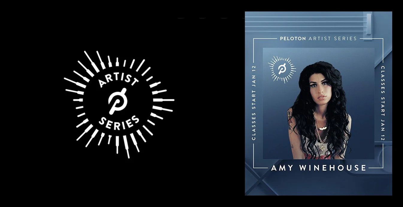
For Peloton to be able to stream music through their content platform, it requires a special partnership through a legal contract. A new vertical was created called “Artist Series”, to celebrate and promote each new artist. This Artist Series “bug” was integrated within each artist promotion.
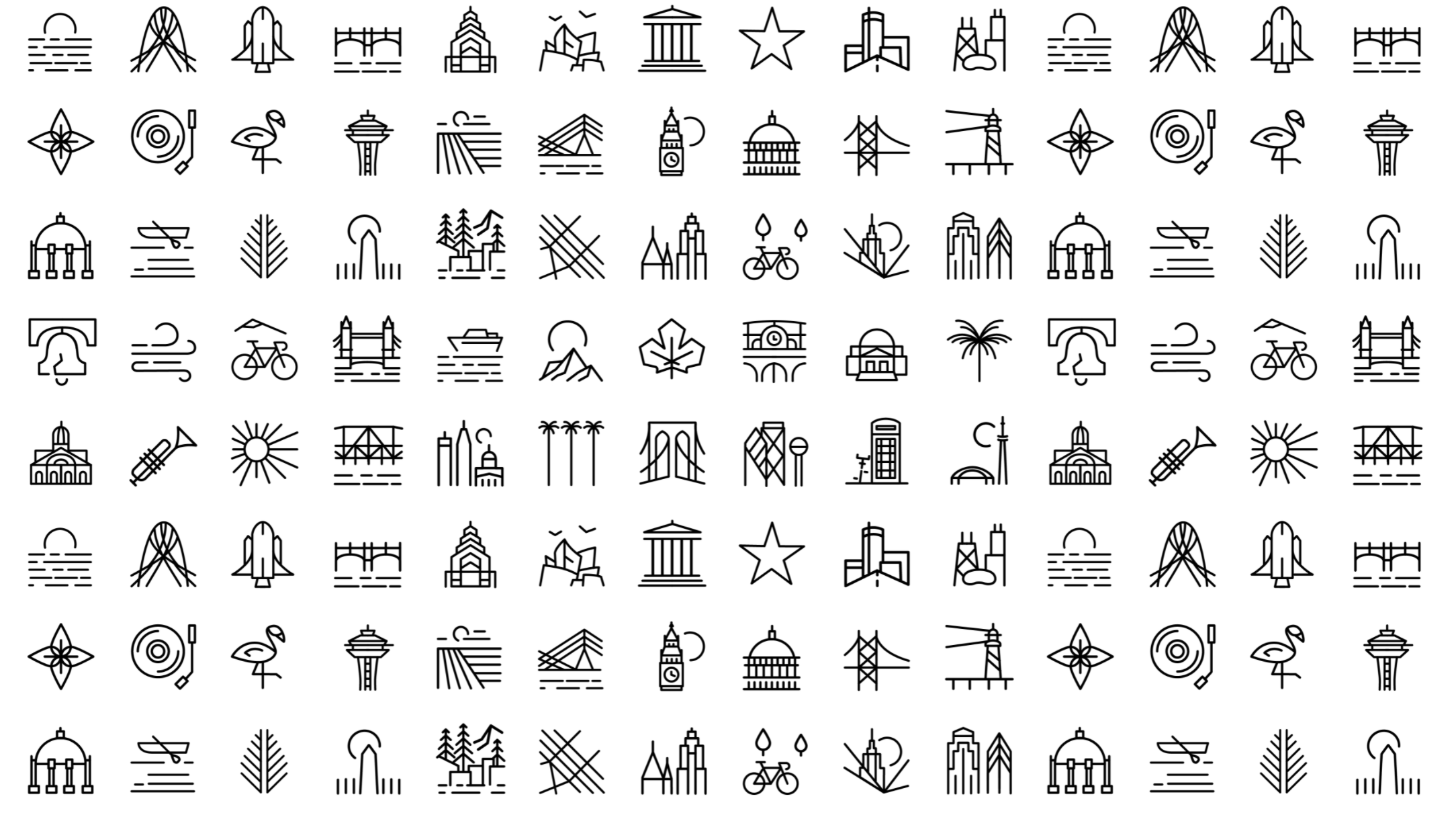
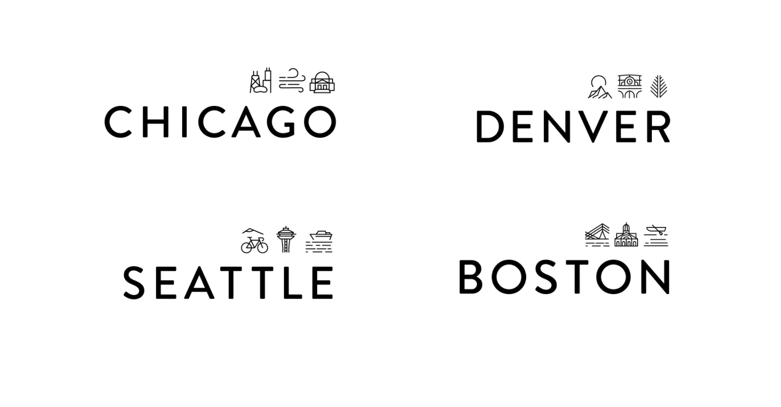
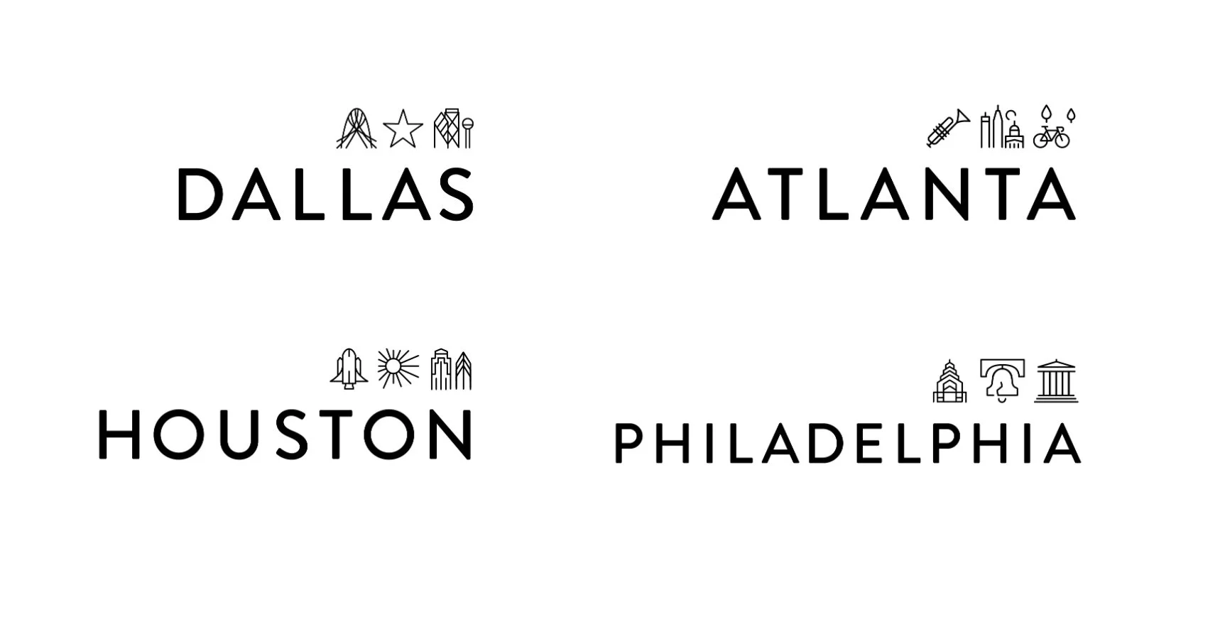
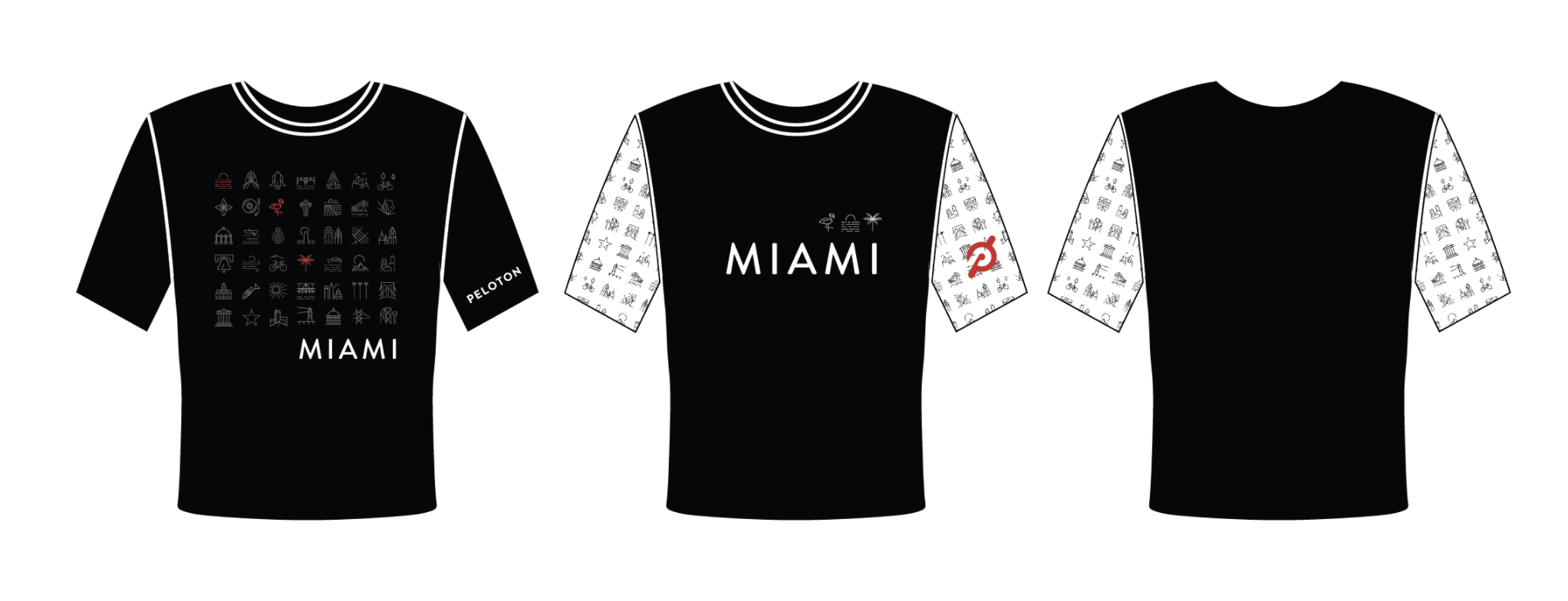
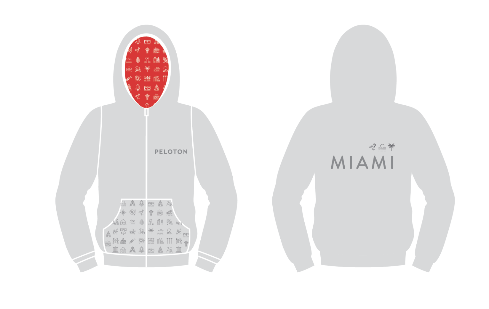
Peloton Apparel wanted to create a collectable “City Collection” available only at retail locations. Each city was repped by three icons. All the icons were combined to make this pattern.
The owner of Crayon Power runs a Playschool for children with disabilities. Her teaching philosophy is that children should learn through exploration. The logo depicts a telescope looking up to the boundless sky.
Amgen Pharmaceuticals launched a new patient support program called Amgen Assist 360™.
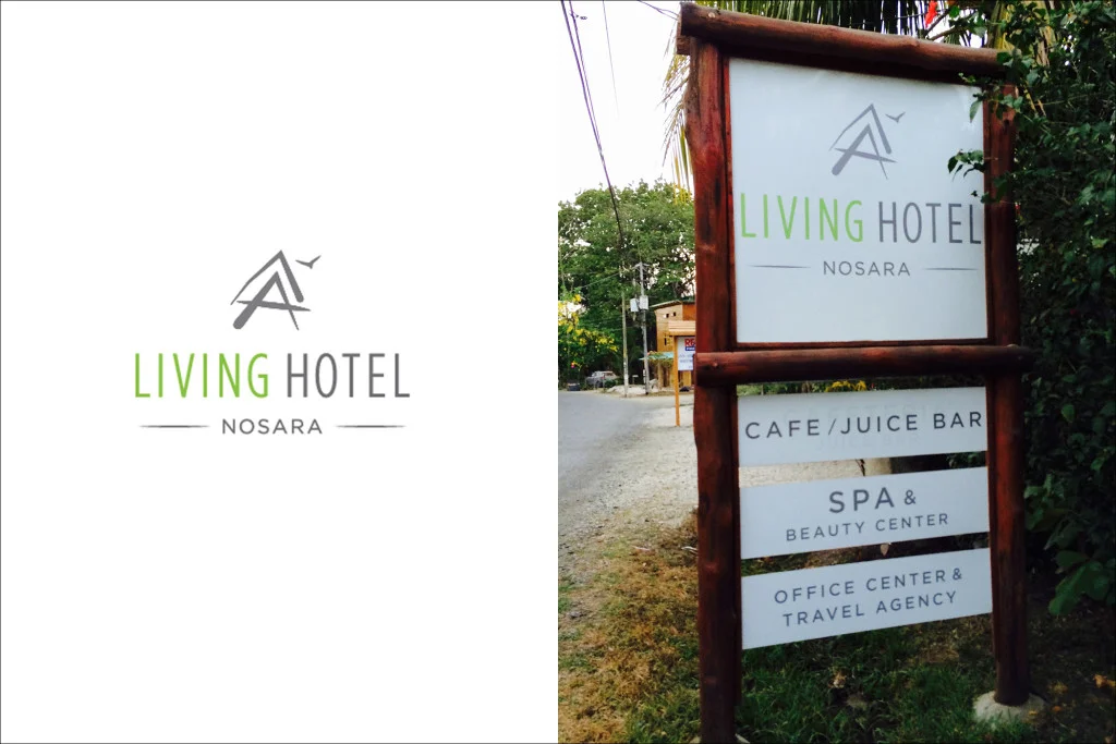
The symbol illustrates the iconic architecture of this hotel in Costa Rica.
Visually Outspoken is a small design shop who educates business owners on how to define their brand and visually communicate it. While the symbol might be simple (and celestial!), it is derived from an infographic developed to help define a point of differentiation for a brand.
Growth Leaders is consulting agency which offers practical strategies for leaders in large corporations. They wanted to refresh their brand to appear structure and action-oriented.
Elevation is a pilates studio which launched in San Francisco at the beginning of the wellness revolution. The client wanted a logo which expressed lightness, movement, and the connection between mind/body.
When vegan raw food became a luxury trend in San Francisco, I decided to meet up with the owner of Roxanne's restaurant in Marin county. Their strong beliefs with their elegant gourmet style inspired a delicate logo.


